Introduction
This most definitely won't be a revelation for anyone working with time-series on a daily basis, but I came across the importance of proper techniques for visualising them quite recently in a work-related problem, so I decided to generalise the approach slightly and use publicly available data to demonstrate the importance of following method.
We will focus on the visualisation suitable for identifying global trends and patterns in timeseries of FTSE 100 stocks. Other applications might require different forms of visualisation.
It's also worth mentioning that I am by no means an expert on the matter of stocks and financial markets(in fact everything I know was learnt in preparation for this post...), so any of my speculations should be taken with a bucketful of salt or ignored altogether. But if you have the urge to correct me, pleaso do so and I will alter the post.
We will start from the very beginning - mining stocks names from LSE website - and documenting each step as we go, with a few unexpected(but planned) twists and cheeky cliffhangers.
Getting FTSE 100 stocks
Our main data will come from Quandl, which stores all LSE stocks in datasets that have names like "LSE/HIK" where "HIK" is the stock's name. FTSE 100 aggregated top 100 performing stocks on LSE, so we can use it as a reference for the most interesting stocks. Let's mine the stock names from LSE's website.
Stock information is stored in HTML tables scattered across several pages with the same base url: "http://www.londonstockexchange.com/exchange/prices-and-markets/stocks/indices/summary/summary-indices-constituents.html?index=UKX&page=1". Varying the "page" parameter from 1 to 6 we can get all 100 stocks. The script is therefore extremely straightforward:
mine.py
import requests
import re

url = "http://www.londonstockexchange.com/exchange/prices-and-markets/stocks/indices/summary/summary-indices-constituents.html?index=UKX&page={0}"
stocks = []
stock_names = []

for i in range(6):
    page = requests.get(url.format(i+1))
    _stocks = re.findall('<td scope="row" class="name">(.+?)</td>', page.text)
    _stock_names = re.findall('<a.*title="View detailed prices page" target="">(.+?)</a>', page.text)

    stocks += _stocks
    stock_names += _stock_names

with open("stock_codes.csv", "w") as f:
    f.write("Stock, Name\n")
    for x in zip(stocks,stock_names):
        f.write('"'+x[0]+'", "'+x[1]+'"'+"\n")
After it finishes, we get a little CSV file that looks something like this:
Stock, Name
"III", "3I GRP."
"ABF", "A.B.FOOD"
"ADN", "ABDN.ASSET.MAN."
"ADM", "ADMIRAL GRP"
"AGK", "AGGREKO"
"AAL", "ANGLO AMERICAN"
"ANTO", "ANTOFAGASTA"
"ARM", "ARM HLDGS."
"AHT", "ASHTEAD GRP."
...
Names are not as important, but will come handy during visualisation time.
Getting Quandl data for stocks
Having all the stocks names, we can now obtain the time-series describing how the stock price changed over time.
We will need to install the Quandl library for R(see installation instructions, also worth setting up auth code to bypass 50-per-hour rate limits) and establish a portal to the Hadleyverse:
# assuming you installed it
library(Quandl)

library(dplyr) # general data wrangling, tbl_df, %>% operator
library(stringr) # query tokenization
library(lubridate) # could be omitted, really, but I do love it too much
library(ggplot) # beautiful plots
Now comes the more interesting part. As I said earlier, Quandl stores all the stocks data for LSE under codes like "LSE/AGK" - so running Quandl("LSE/AGK") will immediately give you a data frame with stock data for Aggreko. There's two caveats though - one, FTSE 100 changes more often than Quandl's LSE database, so some stocks might be missing. Two, some stocks from FTSE 100 have periods(".", e.g. "BP."" is stock name for British Petroleum) in them, but Quandl doesn't allow periods in datasets names.
To tackle problem number one we'll wrap stock data extraction in a function that can handle retrieval errors gracefully. Second problem is not really a problem - we'll just use str_replace_all to replace periods with underscores("_").
We will stack all the datasets for different stocks on top of each other to aid ggplot in plotting this data later on. Here's the function that extracts stocks data for a vector of stocks names:
quandle_stocks <- function(stocks) {

  f <- function(x)
    tryCatch({
      print(paste("LSE", x, sep = "/"))
      cbind(Quandl(paste("LSE", x, sep = "/"), authcode = API_CODE), Stock = x) # 2
    },
    error = function(e) {
      print(e); NULL # 3
    })

  do.call(rbind,lapply(stocks,f)) # 1
}
Notes:
- We apply
fover a vector of stocks names, and then usedo.callto callrbindwith all the extracted data frames as positional arguments - this gives us a long data frame with all the stocks stacked on top of each other. - Here we simply add stock's name as a column to a dataset returned by
Quandl - Any error with any particular stock will result in function returning
NULL, which will then be handled gracefully byrbind- no data will simply be added to the resulting long data frame.
Having this function, one can call it like this: quandle_stocks(c("BP_", "AGK")). But we have already extracted all the stocks names we need, so let's just use them keeping in mind the "." vs. "_" issue.
stock_codes <- read.csv("stock_codes.csv", header=T, stringsAsFactors = F)
all_stocks <- stock_codes$Stock %>%
                str_replace_all("\\.", "_") %>% # replace "." with "_"
                quandle_stocks # pipe that vector in the function we defined earlier
Which, after outputting some debug information(e.g. errors in retrieving stocks "DC_", "SKY" and "TUI" at the time of writing) will produce a dataset with following structure:
> glimpse(all_stocks)
Observations: 29217
Variables:
$ Date       (date) 2015-06-05, 2015-06-04, 2015-06-03, 2015-06-02, 2015-06-01, 2015-05-29, 2015-05-28, 2015-05-27, 2015-05-2...
$ Price      (dbl) 550.5, 554.0, 564.0, 568.5, 560.0, 559.5, 559.5, 562.5, 553.5, 551.5, 560.0, 558.0, 553.5, 548.0, 537.5, 5...
$ High       (dbl) 555.62, 563.00, 570.00, 571.00, 565.10, 567.14, 571.50, 562.50, 556.00, 559.00, 561.00, 561.50, 555.00, 55...
$ Low        (dbl) 548.50, 553.50, 561.50, 560.00, 554.20, 558.50, 559.00, 553.50, 547.50, 548.50, 554.50, 553.50, 546.90, 53...
$ Volume     (dbl) 1149139, 798015, 1850002, 2512969, 1756197, 1198987, 1763846, 875144, 1252053, 1318332, 710568, 1047121, 1...
$ Last Close (dbl) 554.5, 563.5, 569.5, 561.5, 560.5, 563.0, 564.5, 554.5, 550.0, 559.5, 560.0, 555.5, 548.0, 539.0, 534.5, 5...
$ Change     (dbl) 4.0, 9.5, 5.5, 7.0, 0.5, 3.5, 5.0, 8.0, 3.5, 8.0, 0.0, 2.5, 5.5, 9.0, 3.0, 6.5, 16.5, 5.0, 8.5, 12.0, 12.2...
$ Var%       (dbl) 0.72, 1.69, 0.97, 1.25, 0.09, 0.62, 0.89, 1.44, 0.64, 1.43, 0.00, 0.45, 1.00, 1.67, 0.56, 1.23, 3.22, 0.99...
$ Stock      (fctr) III, III, III, III, III, III, III, III, III, III, III, III, III, III, III, III, III, III, III, III, III, ...
The columns we're most interested in are Date, Price and Stock. Now, let's get a feel of the date with increasingly better plots.
First, bad plot
First and most obvious way of plotting the stock data would be to treat it as timeseries - how the Price changes depending on the Date.
all_stocks %>% ggplot(aes(Date,Price, colour = Stock)) +
                    geom_line() +
                    guides(colour = guide_legend(ncol = 4)) +
                    theme(text = element_text(size=14)) +
                    scale_x_date(expand=c(0,0)) +
                    ggtitle("FTSE 100 stocks")
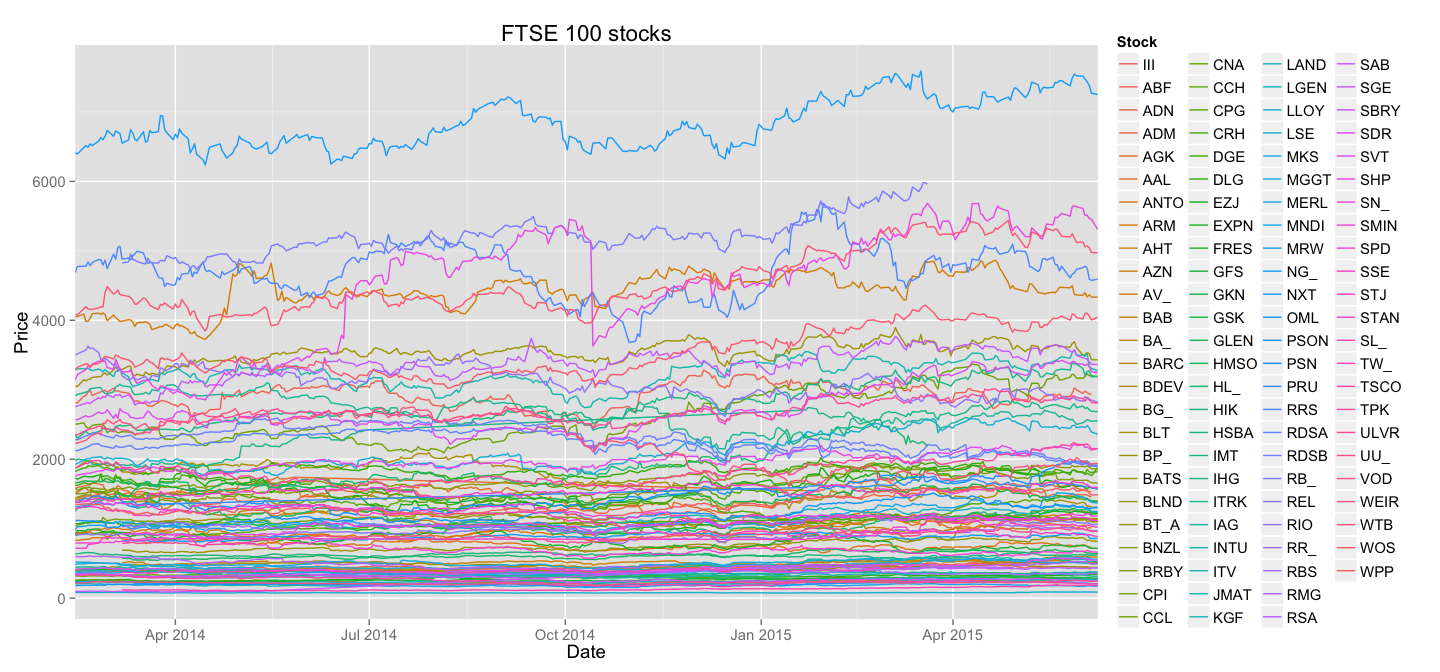
It is obvious that this plot gives us a lot less information than the data actually contains - mainly due to horrifying amount of overlapping in the bottom part of the Price scale. It's also less than obvious to understand what line belongs to which stock - the colour brewer scale of ggplot2 is only good when you have less than 5 groups.
One other thing will also become obvious on the subsequent plots - dramatic difference in stocks prices actually hides interesting trends.
Normalised(but still bad) plot
Now, FTSE 100 aggregates stocks with varying performance - stocks trading at ~77£(LLOY) are there together with those trading at ~6800£(NXT). My first suspicion after looking at the first version of our plot was that trends in smaller stocks will be compressed until indistinguishable from a straight line by larger stocks displayed on the same scale.
For example, let's take those two stocks, LLOY and NXT, and display them on the same plot(just like the one we used before).
 all_stocks %>% filter(Stock %in% c("NXT", "LLOY")) %>%
    ggplot(aes(Date, Price, colour=Stock)) +
        geom_line() +
        theme(text = element_text(size=14)) +
        scale_x_date(expand=c(0,0)) +
        ggtitle("FTSE 100 smallest stock vs. biggest stock")
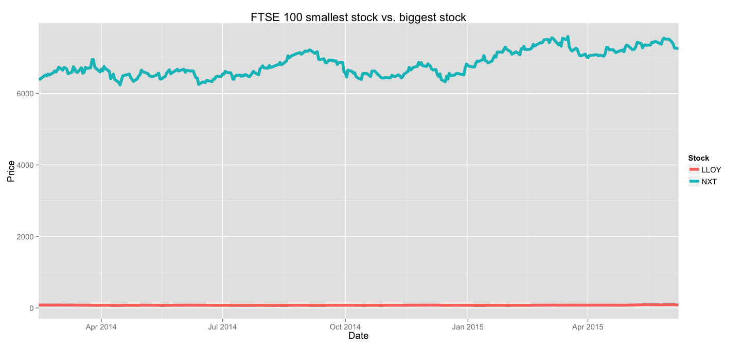
This example clearly shows the importance of scaling before plotting. In the end, for our analysis the absolute value matters less than the behaviour of the stock - how it changed relative to its minimum/maximum/average value(choose the appropriate descriptive statistic based on your application).
So it makes sense to normalise the stocks prices to identify the trends. Let's do exactly that.
normalise <- function(stocks){
   stocks %>% group_by(Stock) %>%
        mutate(Price = (Price-min(Price))/(max(Price) - min(Price))) %>% ungroup
}
This function normalises each stock by representing it as a fraction of the price range - this new, normalised Price will be zero when the stock reaches its absolute minimum, and will be one when it reaches its absolute maximum. Let's try and plot those new lines all on the same plot:
normalise(all_stocks) %>%
    ggplot(aes(Date,Price, colour = Stock)) +
        geom_line() +
        guides(colour = guide_legend(ncol = 4)) +
        theme(text = element_text(size=14)) +
        scale_x_date(expand=c(0,0)) +
        ggtitle("FTSE 100 stocks(normalised)")
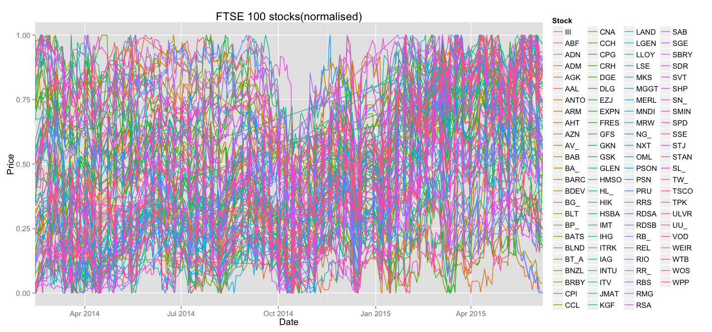
On the first sight it looks as if the plot only got worse. It's certainly less pretty, but let's take a look at what happened to the lines corresponding to LLOY and NXT:
normalise(all_stocks) %>% filter(Stock %in% c("NXT", "LLOY")) %>%
    ggplot(aes(Date, Price, colour=Stock)) +
        geom_line() +
        theme(text = element_text(size=14)) +
        scale_x_date(expand=c(0,0)) +
        ggtitle("FTSE 100 smallest stock vs. biggest stock(normalised")
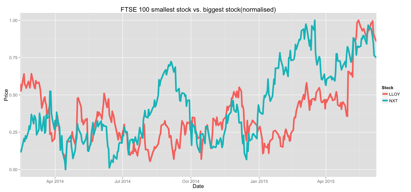
Much better, isn't it? For the purposes of trend analysis - this representation is much more preferrable. If you were to invest in FTSE 100 stocks, you'd invest proportionally to the sizes of the stocks and then only care about the dynamics of your relative investments - not the absolute value for each stock.
This representation lets us identify periods of steady growth and compare speeds of growth between stocks of any value. The absolute value of the stock comes later on when the investment portfolio is being formed.
Also, this plot identifies some significant problems with the data. A careful observer will notice straight lines running across the plot - these are signs of missing data points. We will address this problem later.
Clustering time-series
Now, we can make a bold assumption that certain stocks behave similarly to other stocks - for example there must be a significant amount of steady risers - stocks that have been growing linearly and consistently until the last data point recorded. Also we'd expect to see several stocks that took a big hit from which they are recovering with varying success.
All those assumptions can be expressed graphically - how certain lines on our big messy plot are similar to other lines. It only makes sense to group them together and separate the plot into several smaller ones that only concentrate on similar stocks.
We'll define clusters of stock behaviour. First thing one needs to address is that clustering algorithms impose a strict rule on the number of dimensions for each data point - it must be the same across all data points. It's not the case in our data, as the histogram below will show, some stocks have more recorded data points, some - less.
all_stocks %>%
    count(Stock) %>%
    ggplot(aes(n)) +
        geom_histogram(binwidth=1) +
        xlab("Number of data points") +
        ylab("Number of stocks") +
        theme(text = element_text(size=14))
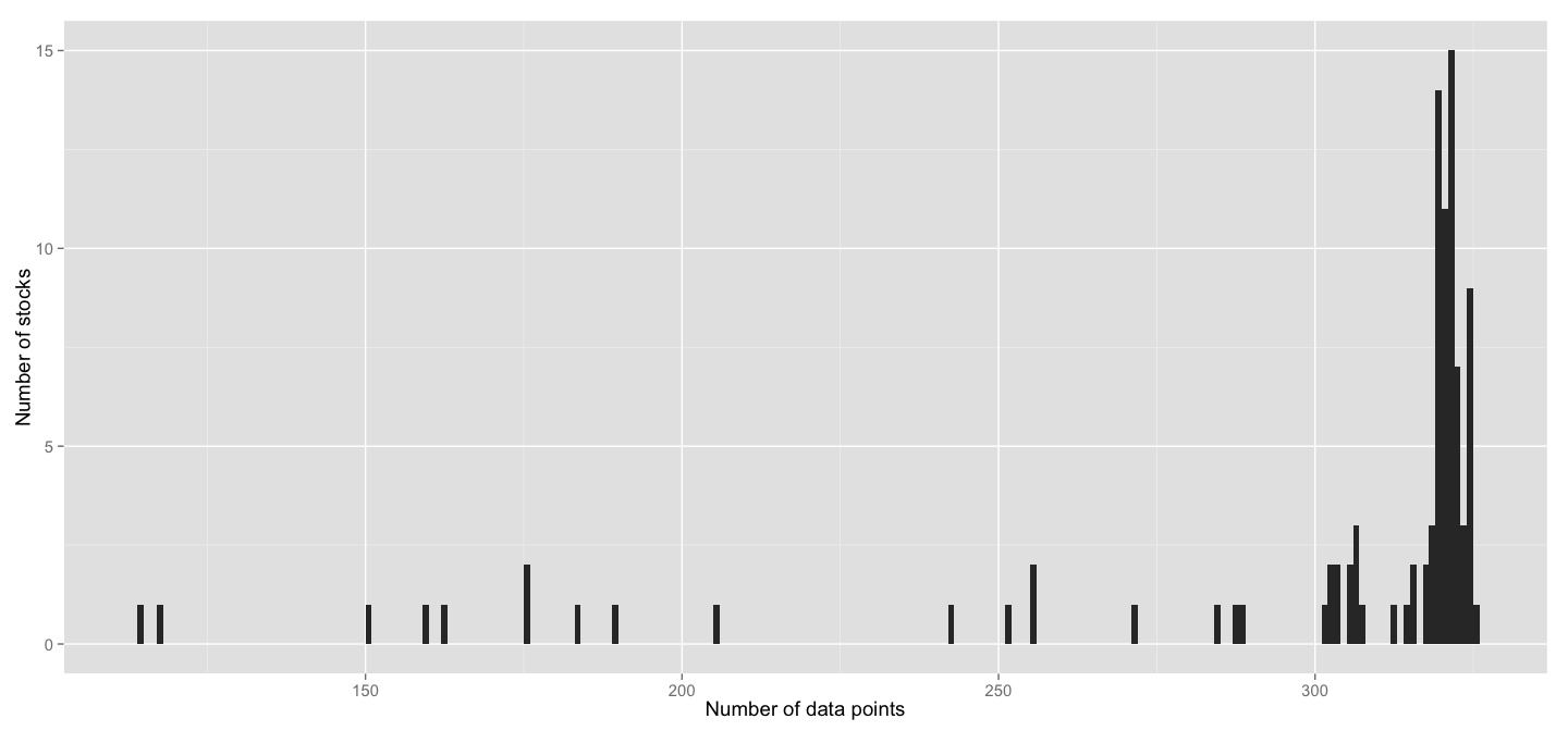
Even though the majority of stocks has more than 300 data points(in fact 75% of stocks have more than 305), the numbers still vary, plus there's plenty of stocks with significantly fewer data.
For any form of clustering to be applied we need to convert all those data points into a fixed number of dimensions, say, 100. To do that, we'll use approximated function of stocks behaviour and its values at 100 points taken over a regular grid. First, let's become acquainted with the approxfun function from base R. Take a look at the example:
points <- c(0,0.5,1)
values <- c(0.8, 0.3, 0.9)

new_points <- c(0.1,0.2,0.9,0.94)
approximated_function <- approxfun(points, values)

new_values <- approximated_function(new_points)
approxfun simply approximates the function given points and function's values at those points and then returns a new function which can then be directly used to get values at a new set of points. For our purposes I think it's good enough. Note, that we could've re-written the entire example as approxfun(c(0,0.5,1), c(0.8, 0.3, 0.9))(c(0.1,0.2,0.9,0.94)) and it would give the same result as new_values. That's the notation we'll use for brevity later.
Now, given that we are about to compress the date axis of each stock to the same scale, it's no longer appropriate to use actual dates, we'll use numbers from 0.0 to 1.0 instead, where 0.0 is the first data point for stock, and 1.0 is the last one. We will then use approxfun and a fixed grid of points to get a decent approximation of what each stock's behaviour looks like as a 100-dimensional vector.
So let's write a function that compresses our stock data points into a fixed dimensionality vector.
smooth <- function(stock, ndim=100){
  normalise(stock) %>% group_by(Stock) %>% # 1
    arrange(Date) %>%
    mutate(NormDate = (as.numeric(Date)-min(as.numeric(Date)))/(max(as.numeric(Date))-min(as.numeric(Date)))) %>% #2
    do(data_frame(Stock=.$Stock[1],
                  Point=seq(0,1, length.out=ndim), #3
                  Price=approxfun(.$NormDate, .$Price)(seq(0,1, length.out=ndim)))) %>% #4
    ungroup
}
Notes:
- We use the
normalisefunction we defined earlier to scale prices. - We convert each actual Date object to number from 0.0 to 1.0
- A grid of
ndim(100) points over[0.0, 1.0] - See example above, we basically approximate the Price as a function of normalised date and then evaluate this function on a regular grid of 100 points.
Now, let's take a look at LLOY and NXT stocks in this representation to make sure that our smoothing actually worked as expected:
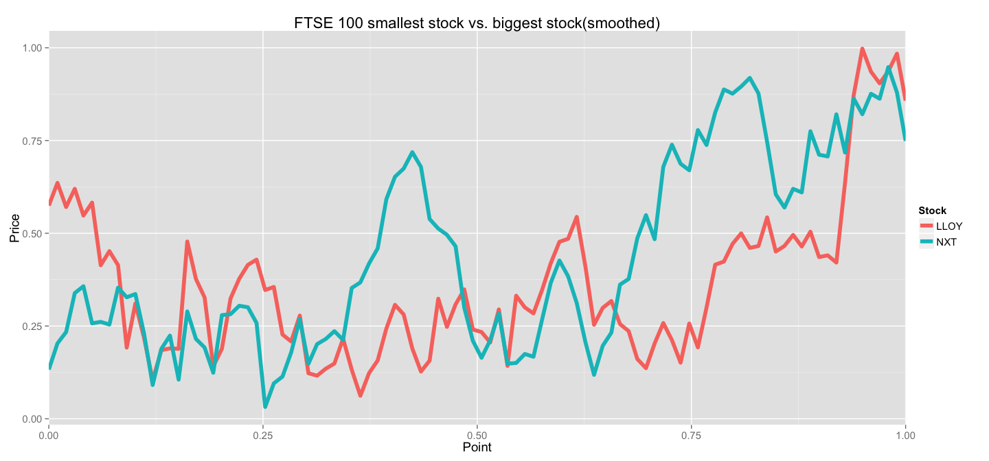
Looks good to me! Sure, we lost some detail by performing an under-sampling(100 points instead of ~325 in original data), but we managed to capture the main trends. And now we can use this data directly in any clustering algorithm.
Well, almost directly. Most clustering algorithms available in R will expect data in the shape of a matrix, where columns represent variables and rows represent observations. Our data is... well, somewhat different. Here's what it looks like right now:
> smooth(all_stocks)
Source: local data frame [9,800 x 3]

   Stock      Point     Price
1    III 0.00000000 0.1692308
2    III 0.01010101 0.2132190
3    III 0.02020202 0.2398376
4    III 0.03030303 0.2243627
5    III 0.04040404 0.2448004
6    III 0.05050505 0.2379277
7    III 0.06060606 0.1789759
8    III 0.07070707 0.2052786
9    III 0.08080808 0.1417550
10   III 0.09090909 0.1376494
..   ...        ...       ...
What we want is for each Stock to spread the 100 values of Price into 100 different columns. Let's use tidyr's conveniently named spread function:
smooth(stock) %>% group_by(Stock) %>%
    arrange(Point) %>% # 1
    mutate(P=paste("P", str_pad(dense_rank(Point), 4, pad="0"))) %>% # 2
    select(-Stock, -Point) %>% # 3
    spread(P, Price) # 4
Notes:
- I always sort the points in groups because I'm severely paranoid and I think I once was bitten by this. May be it was a dream. Better safe than sorry.
- I added a fake column whose values will become new column names
- We help
spreadby only leaving the new variable names and their values - This "zips" fake column names with their respective values and then performs the transformation.
Our data will now look like this:
Source: local data frame [19 x 101]

   Stock     P 0001     P 0002     P 0003     P 0004     P 0005     P 0006     P 0007     P 0008     P 0009      P 0010     P 0011
1    HIK 0.00000000 0.04778993 0.10322777 0.12273866 0.14169262 0.18948128 0.16580846 0.24235589 0.30799727 0.284597858 0.31711855
2   HSBA 0.75647172 0.92336355 0.80954318 0.70199599 0.65978093 0.55019030 0.37168424 0.31514570 0.44932547 0.488567361 0.49434905
3    IMT 0.04666057 0.09154676 0.07972682 0.12534309 0.15955530 0.16854732 0.10621309 0.12498267 0.11539919 0.119021875 0.11380964
4    IHG 0.10749507 0.11423406 0.05818540 0.07270934 0.07175303 0.04342239 0.02097902 0.02719503 0.05718925 0.064042795 0.07073696
5   ITRK 0.80126183 0.85571806 0.92242084 0.83471943 0.94544817 0.94587303 0.82372622 0.83618520 0.87725839 0.964757990 0.91272345
6    IAG 0.41821809 0.44404064 0.43303044 0.42396035 0.41451080 0.39526247 0.35026797 0.38693786 0.31710724 0.337080916 0.39977232
7   INTU 0.36016949 0.35433787 0.36468855 0.26836158 0.26954931 0.08926126 0.10156651 0.11296225 0.08378274 0.044087057 0.09383025
8    ITV 0.37619048 0.38984127 0.32832131 0.29688312 0.30279942 0.26889851 0.23904762 0.31189033 0.22582973 0.193766234 0.24810967
9   JMAT 0.66908213 0.67400454 0.65822476 0.64273166 0.63087396 0.55390865 0.39013322 0.48477529 0.45874201 0.617698726 0.66666667
10   KGF 0.58982412 0.67195828 0.68981904 0.66554363 0.73966423 0.73772270 0.73540049 0.78666058 0.76612228 0.840452261 0.95793361
11  LAND 0.20612813 0.11443122 0.11493768 0.08213050 0.09186573 0.05783930 0.07942939 0.02827720 0.06225674 0.123676880 0.15188093
12  LGEN 0.34033149 0.38640549 0.40861655 0.38844802 0.37599196 0.33516379 0.25578436 0.08474803 0.03182097 0.002611753 0.07527206
13  LLOY 0.57475083 0.63578895 0.57077419 0.61985302 0.54778684 0.58262022 0.41383939 0.45179368 0.41418057 0.191902413 0.31068157
14   LSE 0.19591346 0.28328052 0.31778118 0.30364948 0.30124563 0.28670115 0.16881556 0.29108392 0.24732906 0.257320804 0.27684295
15   MKS 0.47507056 0.52756991 0.56277260 0.56042076 0.56305767 0.46727387 0.36477665 0.41573306 0.33162291 0.326121041 0.40839249
16  MGGT 0.59240821 0.54345100 0.51462352 0.46993268 0.44094963 0.26641650 0.14006902 0.27135072 0.24925044 0.312930173 0.32273576
17  MERL 0.25826772 0.30858984 0.36876906 0.35025054 0.25425117 0.33176648 0.45058459 0.37253374 0.37851746 0.365282749 0.38504732
18  MNDI 0.06233766 0.15798242 0.18095238 0.21605667 0.25892693 0.25929424 0.21978224 0.22172373 0.17453321 0.151305260 0.20829070
19   MRW 0.91309131 0.87508751 0.95967375 0.91279128 0.90619062 0.89724528 0.60376038 0.62776278 0.64938716 0.675434210 0.59409274
Variables not shown: P 0012 (dbl), P 0013 (dbl), P 0014 (dbl), P 0015 (dbl), P 0016 (dbl), P 0017 (dbl), P 0018 (dbl), P 0019 (dbl),
  P 0020 (dbl), P 0021 (dbl), P 0022 (dbl), P 0023 (dbl), P 0024 (dbl), P 0025 (dbl), P 0026 (dbl), P 0027 (dbl), P 0028 (dbl), P
  0029 (dbl), P 0030 (dbl), P 0031 (dbl), P 0032 (dbl), P 0033 (dbl), P 0034 (dbl), P 0035 (dbl), P 0036 (dbl), P 0037 (dbl), P 0038
  (dbl), P 0039 (dbl), P 0040 (dbl), P 0041 (dbl), P 0042 (dbl), P 0043 (dbl), P 0044 (dbl), P 0045 (dbl), P 0046 (dbl), P 0047
  (dbl), P 0048 (dbl), P 0049 (dbl), P 0050 (dbl), P 0051 (dbl), P 0052 (dbl), P 0053 (dbl), P 0054 (dbl), P 0055 (dbl), P 0056
  (dbl), P 0057 (dbl), P 0058 (dbl), P 0059 (dbl), P 0060 (dbl), P 0061 (dbl), P 0062 (dbl), P 0063 (dbl), P 0064 (dbl), P 0065
  (dbl), P 0066 (dbl), P 0067 (dbl), P 0068 (dbl), P 0069 (dbl), P 0070 (dbl), P 0071 (dbl), P 0072 (dbl), P 0073 (dbl), P 0074
  (dbl), P 0075 (dbl), P 0076 (dbl), P 0077 (dbl), P 0078 (dbl), P 0079 (dbl), P 0080 (dbl), P 0081 (dbl), P 0082 (dbl), P 0083
  (dbl), P 0084 (dbl), P 0085 (dbl), P 0086 (dbl), P 0087 (dbl), P 0088 (dbl), P 0089 (dbl), P 0090 (dbl), P 0091 (dbl), P 0092
  (dbl), P 0093 (dbl), P 0094 (dbl), P 0095 (dbl), P 0096 (dbl), P 0097 (dbl), P 0098 (dbl), P 0099 (dbl), P 0100 (dbl)
Now this data can be used in a clustering algorithm, if we convert it to a proper matrix first. Let's arrange the previous spreading step and the clsutering into one nice function:
cluster_stocks <- function(stock, N=2){
  smooth(stock) %>% group_by(Stock) %>%
    arrange(Point) %>%
    mutate(P=paste("P", str_pad(dense_rank(Point), 4, pad="0"))) %>%
    select(-Stock, -Point) %>%
    spread(P, Price) %>%
    ungroup %>%
    do(data_frame(Stock=.$Stock,
                  Cluster = kmeans(as.matrix(select(., -Stock)), N)$cluster))
}
Notes:
- Here we just run basic
kmeansalgorithm on the matrix with all data points for stocks and a given number of clusters. We remove the column "Stock" and useas.matrixto simplify our object. Then we take the cluster numbers and return them in a new column.
Here's the sample result:
> cluster_stocks(all_stocks, N=10)
Source: local data frame [98 x 2]

   Stock Cluster
1    III       6
2    ABF       3
3    ADN       4
4    ADM       4
5    AGK       1
6    AAL       8
7   ANTO       7
8    ARM       2
9    AHT      10
10   AZN       3
..   ...     ...
Clustered plot
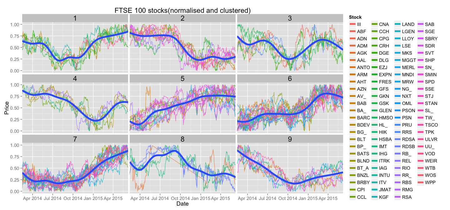
Now we can use clustering information to group similar stocks together. Let's just create facets for each cluster and plot only stocks belonging to that cluster. For each cluster we will also display a line that best represents the pattern shared by the stocks in it - we'll use geom_smooth for that.
normalise(all_stocks) %>%
  inner_join(cluster_stocks(all_stocks, N=9)) %>%
  ggplot(aes(Date, Price, colour = Stock)) +
    geom_line(alpha=0.7) +
    geom_smooth(aes(group=Cluster), size=2, alpha=0.0) +
    guides(colour = guide_legend(ncol = 4)) +
    theme(text = element_text(size=14), strip.text=element_text(size=17)) +
    scale_x_date(expand=c(0,0)) +
    ggtitle("FTSE 100 stocks(normalised and clustered)") +
    facet_wrap(~Cluster)
And here it is, the final plot:
Conclusion
Even this simple plot shows us some interesting differences between stocks and how they recover from drops - stocks in cluster number 2 are less desirable than stocks in cluster number 9, as the latter ones seem to recover steadily form the hit. Is cluster number 2 just a stretched out version of first 50% of data points of cluster number 1?
Many interesting insights can be drawn just from looking at stocks in this grouped manner. Interesting clusters can then be examined more thoroughly on an absolute price plot.
Many other clustering techniques can be used, and I would especially recommend interactive hierarchical clustering to define a good number of cluster.
Code can be found in the accompanying Github repo.
Thanks for getting this far!