Introduction
A man is defined not by the way he looks, but what he looks for. And these days it is exceptionally easy to find out, what you're looking for – Google provides access to your search history starting from a certain point in time which is probably different for everyone (my archive started from 2011 though it goes without saying that I've been using Google long before that). And while in different periods of my life I have found myself googling some really weird shit (like, really weird, from the depths of underwebs), I decided to rely on the safety of large numbers and post the results of this trip down the memory lane no matter what kind of deviation they shall display.
This doesn't serve any scientific purpose, it's more of a demonstration of the use of fantastic packages R can offer, applied to a dataset from a real world. This is not a tutorial on R language or aforementioned packages per se, but rather a primer of their usage in real (well, almost) world.
It's a well-known fact, that 70%-90% of data scientist's time is spent shaping the data into shape needed for exploratory analysis. And whilst there's no upper-boundary on the dirtiness of data (some things I've seen still keep me awake at night, especially in publicly available governmental datasets), this data will be somewhere in the bottom 10% percentile – most of the time is spent massaging the data, which is more fun than cleaning it and battling with missing values.
Getting data
My previous attempt to analyse my own google searches was stumped by Google's own malfunction during archive creation, but this time I went to Web & App Activity and succesfully managed to download the archive. The main thing it contains is json files with queries:
2011-01-01 January 2011 to March 2011.json    2012-07-01 July 2012 to September 2012.json   2014-01-01 January 2014 to March 2014.json
2011-04-01 April 2011 to June 2011.json       2012-10-01 October 2012 to December 2012.json 2014-04-01 April 2014 to June 2014.json
2011-07-01 July 2011 to September 2011.json   2013-01-01 January 2013 to March 2013.json    2014-07-01 July 2014 to September 2014.json
2011-10-01 October 2011 to December 2011.json 2013-04-01 April 2013 to June 2013.json       2014-10-01 October 2014 to December 2014.json
2012-01-01 January 2012 to March 2012.json    2013-07-01 July 2013 to September 2013.json   2015-01-01 January 2015 to March 2015.json
2012-04-01 April 2012 to June 2012.json       2013-10-01 October 2013 to December 2013.json 2015-04-01 April 2015 to June 2015.json
Each JSON has the same structure:
{
   "event" : [
      {
         "query" : {
            "id" : [
               {
                  "timestamp_usec" : "1325324851354700"
               }
            ],
            "query_text" : "jonathan ross dexter"
         }
      },
      {
         "query" : {
            "query_text" : "johnatan ross dexter",
            "id" : [
               {
                  "timestamp_usec" : "1325324848005857"
               }
            ]
...
Timestamps are in microseconds, but we don't need this kind of precision, so we can safely trim last 6 digits and get a regular UNIX timestamp that R can understand. Also, each query can be associated with several ids, each having a different timestamp – to my understanding, this groups image searches. We'll ignore that and just take the minimum of timestamps (or we could take the first one).
Given that the idea of working with multiple(!) JSON(!!) files(!!!) and R gives me shivers (my knowledge of available packages is probably severely outdated), I wrote a tiny Python script that converts everything into a nice flat csv dataset:
import sys
import json
import glob
import os.path
import csv

if(len(sys.argv) < 2):
    exit("Usage: create_dataset.py searches_folder")

fold = sys.argv[1]

writer = csv.DictWriter(sys.stdout, fieldnames=["Timestamp", "Query"], quoting=csv.QUOTE_NONNUMERIC)
writer.writeheader()

# scan all json files in the folder
for queries_file in glob.glob(os.path.join(fold, "*.json")):
    # load json
    with open(queries_file) as f:
        queries = json.load(f)

    for query in queries["event"]:
        query=query["query"]
        # extract timestamp with removed microseconds
        timestamp = min(int(query_id["timestamp_usec"][0:-6]) for query_id in query["id"])
        writer.writerow({"Timestamp": timestamp, "Query": query["query_text"]})
After running this script on the folder with extracted JSON files, we will have a csv file with two columns: timestamp and query. Fire up your R console, or RStudio(if you still don't use it, you need to stop here for a moment and rethink your life priorities).
Preparing data
First, let's establish a portal to Hadleyverse:
library(dplyr) # general data wrangling, tbl_df, %>% operator
library(stringr) # query tokenization
library(lubridate) # could be omitted, really, but I do love it too much
library(ggplot) # beautiful plots
If you don't have any of those packages, install them, they are guaranteed to transform the way you see data analysis, both in R and in general. Let's load our dataset and have a first look at it:
# immediately convert it do tbl_df for pretty printing
> ds <- tbl_df(read.csv("dataset.csv", stringsAsFactors = F))
# convert integer timestamp to R's native datetime object(POSIXct)
> ds$TimeStamp <- as.POSIXct(ds$Timestamp, origin = "1970-01-01")

# print some rows starting from the most recent queries
> ds %>% arrange(desc(TimeStamp))
Source: local data frame [35,328 x 3]

    Timestamp             Query           TimeStamp
1  1433067125       colourout R 2015-05-31 11:12:05
2  1433067122         colourout 2015-05-31 11:12:02
3  1433023552    predestination 2015-05-30 23:05:52
4  1433018900       sarah snook 2015-05-30 21:48:20
5  1433018895    predestination 2015-05-30 21:48:15
6  1433014242 focaccia di recco 2015-05-30 20:30:42
7  1433011327                 н 2015-05-30 19:42:07
8  1433004348          Thatcher 2015-05-30 17:45:48
9  1432997333    predestination 2015-05-30 15:48:53
10 1432993008  weather brighton 2015-05-30 14:36:48
I kept the original integer Timestamp to see if the conversion worked as I expected. Also, I had to reorder the data frame, but only because my oldest queries were almost exclusively in Russian, which would reduce the demonstraction power.
Languages stats
I decided to take a look at how the language of queries changed over time. I'll use a very crude and inaccurate method of language detection (thankfully, Russian and English have completely different character sets), which will misfire on queries like "translate
So let's take a look at the code that generates the plot with cumulative sums of number of queries in each language per month. This will demonstrate the power and, even more importantly, the readability of the methods, provided by Hadleyverse's packages:
> language_usage_plot <- ds %>%
        # we group all queries by the month and calculate the counts below in that month
        group_by(Month=round_date(TimeStamp, "month")) %>%  # round each timestamp to the month it falls in
        summarise(Russian=sum(str_detect(Query, "[а-яА-я]")), # count Russian queries
                  English=sum(str_detect(Query, "[a-zA-Z]"))) %>% # count English characters
        ungroup %>%
        gather(Language, Queries, -Month) %>% # see notes below
        group_by(Language) %>%
        arrange(Month) %>% # order is important for cumsum to make sense
        mutate("Number of queries" = cumsum(Queries)) %>% # will sum them across months in the Language group
        ungroup %>%
        ggplot(aes(Month, `Number of queries`, colour=Language)) +
          geom_line()
Notes:
gather(Language, Queries, -Month)
This is a very important step, which converts data in wide format:
Source: local data frame [54 x 3]

        Month Russian English
1  2011-01-01       2       4
2  2011-02-01       2      10
3  2011-03-01       9       6
4  2011-04-01       9      32
5  2011-05-01       8      10
To data in long "molten" format:
Source: local data frame [108 x 3]

        Month Language Queries
1  2011-01-01  Russian       2
2  2011-02-01  Russian       2
3  2011-03-01  Russian       9
4  2011-04-01  Russian       9
5  2011-05-01  Russian       8
Note the doubled number of rows and different organisation of columns. This format is native to ggplot, hence the extremely simple plotting command at the end of the pipeline.
This code produces a plot like this:
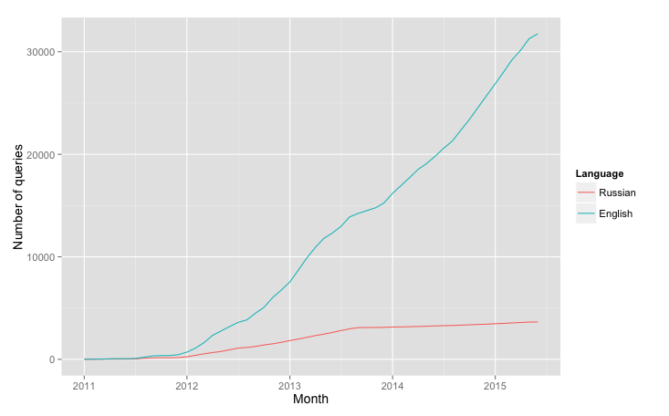
Which shows, that my transition into English culture started long before actual moving to London.
Tokenizing queries
With that out of the way, let's do something slightly more entertaining – express my life in trends and topics without defining them manually. We will use word tokens as topics. So let's break down each query into a list of words:
words_index <- ds %>%
  group_by(Query, TimeStamp) %>% # treat repeated queries as separate entities to have more consistent counts
  do(data_frame(Word = tolower(unlist(str_extract_all(.$Query, "([a-zA-Zа-яA-Я']+)"))))) %>% # see notes below
  ungroup
The line
do(data_frame(Word = tolower(unlist(str_extract_all(.$Query, "([a-zA-Zа-яA-Я']+)"))))) %>% # see notes below
makes use of dplyr's do method that provides a convenient method for running an arbitrary computation on a group of rows. In our particular case we merely extract all sequences of cyrillic and latin characters (note the apostrophe to avoid extracting "s" from "it's" and other similar cases). Then we unlist the nested structure to get a plain vector of words which will then be added to the modified group (with all words in lower case).
It's worth noting, that this operation takes a suprising amount of time (about a minute) for such a small dataset. Especially when extraction itself is rather fast:
> system.time(X <- tolower(unlist(str_extract_all(ds$Query, "([a-zA-Zа-яA-Я']+)"))))
   user  system elapsed
  1.863   0.046   1.935
My suspicion is that the constant reallocation of memory (we cannot predict the number of rows in the result unless we actually extract the words, that's the catch) slows down the process. Or may be some internal unomptimized routines in dplyr. Either way, I don't mind waiting for a minute, but I would certainly redesign this solution for a bigger dataset.
The general rule is to create the most obvious and readable solution first, and then optimise it bit by bit, should it prove necessary.
Words ranking and Zipf's law
Back to words. Let's look at the rankings:
> words_index %>% count(Word) %>% arrange(desc(n))
Source: local data frame [21,390 x 2]

     Word    n
1    ruby 1055
2     the  964
3       r  849
4      in  783
5  python  746
6      to  706
7  london  686
8      of  643
9  chords  559
10      a  404
What "the"..? Not good. Let's filter out the stopwords. Gladly, R handles URLs better than any language:
# download a list of stopwords
> stopwords <-
suppressWarnings(readLines(
  "http://xpo6.com/wp-content/uploads/2015/01/stop-word-list.txt"
))
# filter our index
> words_index <- words_index %>% filter(!(Word %in% stopwords))
> words_index %>% count(Word) %>% arrange(desc(n))
Source: local data frame [21,157 x 2]

     Word    n
1    ruby 1055
2       r  849
3  python  746
4  london  686
5  chords  559
6  lyrics  346
7  ubuntu  298
8  ggplot  284
9   rails  257
10 oracle  232
Much better now. One look at the numbers suggests the kind of distribution I used to see al the time during my relatively brief experience with Information Retrieval - Zipf law. Let's take a closer look at it:
> word_rank_plot <- words_index %>%
    count(Word) %>% # see code above
    top_n(100, n) %>% # take top 100 words
    ggplot(aes(dense_rank(-n), n)) + # we use dense_rank(-n) to get rank(possibly repeated) for each word
      geom_line() + xlab("Word rank") +
      ylab("Number of queries") +
      scale_x_continuous(breaks = seq(0, 100, by = 5)) +
      geom_text(aes(
        label = Word,
        alpha = log(100 / dense_rank(-n)),
        hjust = -0.8 # log to make colour fade slower
      ), show_guide = F) + # don't show legend for alpha
      geom_point() +
      ggtitle("Word rank")
This is a relatively simple plot that doesn't use too many of the ideas we haven't used before. And this is what it looks like:
Just as suspected! This looks like a perfect example of Zipf's law, the kind of plot you usually see in the books(or log-log plot, but it's boring).
The interesting thing about this finding is that even on such small dataset with short queries, the law, which is supposed to hold for English language, still shines through. Even though "the" is only in second place - but this can be easily explained by the fact that any person familiar with how search engines work will usually omit this and other stopwords from the query as they bear little or no significance on results(with exceptions, for example "the who" vs. "who").
Trends and topics
Now, let's do slightly more plotting - I have a sucpicion that the changes in my development stack were greatly affected by two events – moving to London to study and getting a job there a year later. I will demonstrate that change in the best way possible (subjective, of course), and then explain why those changes happened. But you can safely skip the explanation if you're not interested in my life. There is no quiz at the end, don't worry. Or is there?
We will take six of the top ranking words and plot their usage over time, identifying a couple of notable dates(guess what I'm going to call this variable). First, notable dates and top words:
# did you guess right?
notable_dates <- data_frame(NotableDate = c(ymd("2013-09-16"), ymd("2014-09-01")),
                            WhyNotable = c("Moved to London", "Started new job"))
# getting top 6 words, see notes below
top_words <- words_index %>% count(Word) %>% top_n(6, n) %>% .$Word
The most interesting thing about the last line is .$Word - which is my personal favourite for extracting one column from the result of dplyr's pipeline. As you might have seen above, . has a special meaning in dplyr's pipeline - it represents data frame of current group. Without grouping it contains the entire dataset, and we use familiar $ to get one column from it.
Next, to the plot itself. It's not complicated at all, most of the lines are actually for customisation purposes:
notable_dates_plot <- words_index %>%
  filter(Word %in% top_words) %>%
  ggplot(aes(TimeStamp, fill = Word)) +
  geom_vline(aes(xintercept = as.numeric(NotableDate), # see notes below
                 colour = WhyNotable),
             size = 2, show_guide = T,
             notable_dates) +
  geom_histogram(colour = "gray0") +
  facet_wrap(~Word, scales = "free_y") +
  scale_x_datetime("Date", breaks = date_breaks("6 months"), # thanks to "scales" package, we can use those amazing helpers
                   labels=date_format("%b, %Y")) +
  scale_fill_discrete("Word") +
  scale_colour_manual("Notable dates", values = c("red", "orange")) +
  ylab("Number of queries") +
  theme(axis.text.x=element_text(angle=45), # see ggplot's help pages for information about theme's parameters
        legend.text=element_text(size=14),
        strip.text=element_text(size=14)) +
The peculiar construct in geom_vline, xintercept = as.numeric(NotableDate) is required because internally time objects are represented as integers, therefore ggplot will expect xintercept to be of the same type, as the underlying scale. I find this feature(or bug) somewhat annoying, as I always forget the reason for the error message it produces.
We don't do much sophisticated processing here, instead we try to arrange the information on the plot in condensed manner, but so it still shows the underlying patterns in data.
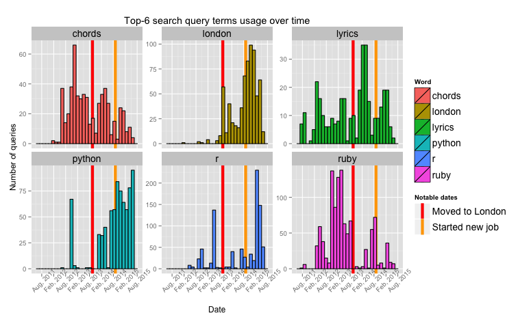
And here it is. The year between moving to London and starting a job was the year I was getting my Master's degree.
Conclusion
Personal notes (the ones you can actually skip):
- Increasing usage of Python right before getting a job(my MSc project was about neural networks and all the simulations were done in Python, there was only 5 days between submission and starting the job).
- Drop in Ruby usage until right before submitting the paper – it's in this time that I wrote (and abandoned) octane to aid me in visualising what the hell was going on in those bloody neural networks. Before moving to London Ruby was my main go-to language and a centerpiece of my work stack.
- Increased interest in London right after getting the job - more money meant more entertainment opportunities.
- Interestingly similar patterns in "chords" and "lyrics" over the months spent at university. I guess there was too much drinking going on in the beginning, and then too much writing at the end.
Thanks for getting this far!
The code for producing all of those plots is available on blog's github, just feed it your own data and it probably won't explode(I take no responsbility, but you can email me)